

Good mobile web design is essential for any business website. Your website might look excellent on a laptop, but what happens when someone opens it on their phone? If they need to zoom, wait or fight with tiny buttons, they may leave before making an enquiry.
Mobile optimisation makes your website faster, clearer and easier to use on smaller screens. It also supports SEO and gives potential customers a simpler route to contact you. Here are practical changes that can make a real difference.
What Is Mobile-Friendly Web Design?
Mobile optimisation means adapting a website so people can use it comfortably on phones and tablets. In practice, the layout must fit the screen, text must stay readable and key actions must be easy to find.
Responsive website design provides the foundation. It allows the same website to adjust to different screen sizes. However, a responsive layout alone does not guarantee a good mobile experience. You must also consider speed, navigation, content and forms.
Why Does Mobile Web Design Matter?
For example, a visitor might be comparing suppliers, checking opening hours or looking for a quote. Therefore, every unnecessary step creates another chance to lose their interest.
Importantly, mobile performance also affects search visibility. Google uses the mobile version of a website’s content for indexing. As a result, missing text or broken features on mobile can create problems beyond poor usability.
Good mobile web design connects three goals: a helpful experience, stronger SEO foundations and more opportunities for lead generation.
1. Mobile Web Design Starts With a Responsive Layout

First, check how each page changes between desktop and mobile. A three-column layout might need to become one column. Likewise, wide tables and large banners may need a different presentation.
For a better result, keep these points in mind:
- Make content fit the screen without horizontal scrolling.
- Place the most useful information near the top.
- Give images and text enough breathing room.
- Check that pop-ups do not cover the main content.
Above all, test real pages rather than relying on a homepage preview. Service pages, blog posts and contact forms often behave differently.
2. Improve Mobile Loading Speed
Of course, mobile visitors do not always have a strong connection. Therefore, heavy pages can feel especially slow when someone is travelling or using mobile data.
First, look for large images, unnecessary scripts and too many plugins. Compress images, use suitable file formats and remove features that offer little value. Also, choose reliable hosting and use caching where appropriate.
You can check individual pages with Google PageSpeed Insights. It highlights performance issues and offers suggestions for improvement.
Pay attention to Core Web Vitals as well. These measures cover loading, responsiveness and visual stability. However, do not chase a perfect score at the expense of useful content or features.
3. Improve Navigation in Mobile Web Design
Ideally, people should find key pages without hunting through complicated menus. Therefore, keep the menu short and give important services clear names.
For most business websites, visitors need quick access to services, proof of experience and contact details. For example, a clear menu button helps only when the menu itself feels easy to use.
Also, make your logo link to the homepage and ensure users can close the menu easily. If your site has many services, group them into sensible categories instead of displaying one long list.
4. Make Text Comfortable to Read
Meanwhile, long blocks of text feel even longer on a narrow screen. So, use short paragraphs, descriptive headings and simple words wherever possible.
Also, choose a readable font size and strong contrast between text and its background. Avoid placing important wording over busy photographs. In addition, give headings enough space so they do not run into nearby content.
Accessibility helps everyone, not only visitors with disabilities. For practical guidance, explore the W3C accessibility quick reference.
Finally, keep the message focused. Readers should understand what you offer and why it matters within a few seconds.
5. Make Buttons and Forms Easy to Use
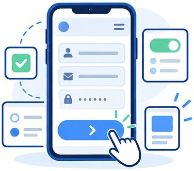
For instance, a neat desktop button might feel impossible to tap on a phone. Therefore, use touch-friendly buttons with enough space around them.
Make calls to action specific. For example, ‘Request a Quote’ tells visitors more than ‘Submit’. Position the main action where it feels natural, especially after explaining a service.
Likewise, mobile forms deserve extra attention:
- Ask only for details you genuinely need.
- Use suitable input types for email addresses and phone numbers.
- Show clear instructions and helpful error messages.
- Check that the keyboard does not hide important fields or buttons.
- Test the confirmation message after submitting the form.
These changes reduce friction. As a result, visitors may find it easier to complete an enquiry rather than abandon the page.
6. Keep Mobile Content Search-Friendly
Importantly, mobile optimisation is not about hiding content to create a cleaner screen. Instead, organise the same useful information in a way that works on every device.
For that reason, keep service descriptions, headings, links and important images available on mobile. Also, check that search engines can access the page and its resources.
Strong SEO also depends on clear answers. For example, explain what your service includes, who it suits and how someone can get started. This helps readers and gives search systems clearer information to understand.
Use Google Search Console to review search performance and mobile Core Web Vitals reports.
7. Optimise Images Without Losing Quality
For example, images can help customers understand your work. However, oversized files can slow down the page and push important content further down the screen.
First, choose images that fit their display size. Then compress them and consider modern formats such as WebP or AVIF. Use descriptive alternative text when an image carries useful meaning.
For example, a roofing company could show a completed roof with a short description. That gives visitors more confidence than a decorative image alone.
Also, avoid delaying the main image at the top of a page unnecessarily. It often plays an important part in how quickly the page feels ready.
8. Mobile Web Design That Supports Lead Generation
Attractive pages matter, but visitors still need a clear next step. Therefore, think about what people want to do when they reach each page.
On a service page, that might mean requesting a quote or making a call. On a blog post, it could mean exploring a related service. In both cases, a relevant call to action should be easy to spot.
Also, add trust signals near important decisions. Reviews, project examples and clear contact details can help visitors feel confident. However, avoid crowding the screen with too many badges or competing buttons.
This approach turns mobile web design into a practical part of lead generation, rather than a purely visual exercise.
How Can You Test Your Mobile Web Design?

First, test with your own phone. Open the homepage, visit a service page and send a test enquiry. Next, repeat those steps on another device or screen size.
Then ask a few simple questions:
- Can you read the text without zooming?
- Do menus, buttons and links work correctly?
- Can you find contact details within seconds?
- Does the enquiry form work from start to finish?
- Does anything jump, overlap or scroll sideways?
Then run key pages through PageSpeed Insights. Review the mobile results, fix the biggest issues and test again. Regular checks matter because new plugins, images and content can affect performance.
Common Questions About Mobile Website Optimisation
Is a responsive website automatically mobile-friendly?
Not always. Responsive layouts adapt to screen sizes, but slow loading, awkward menus and difficult forms can still frustrate users.
Does mobile optimisation help search rankings?
It can support search performance through accessible content and a better page experience. However, mobile improvements alone cannot guarantee higher rankings. Content quality and relevance still matter.
How often should you check mobile performance?
First, check after major updates, design changes or new features. Also, review key pages regularly and investigate any drop in mobile enquiries.
Key Takeaways
- Start with responsive layouts, but test real mobile journeys.
- Improve speed by reducing heavy images and unnecessary scripts.
- Keep navigation, text, buttons and forms simple.
- Make important content available on mobile for users and search engines.
- Guide visitors towards one clear next step on each page.
Conclusion

Ultimately, mobile optimisation is not a one-off design task. Instead, it is an ongoing effort to make your website useful wherever visitors find you.
Start with the changes that cause the most frustration. Then improve speed, navigation and enquiry forms before polishing smaller details. With a clear plan, your mobile website can become a stronger tool for attracting and converting customers.
Need Help Improving Your Mobile Website?
At New World Digital, we build business websites that work across devices and support real business goals. Our web design services focus on clear layouts, easy journeys and effective calls to action.
We can also help you improve visibility through SEO and turn more website visits into enquiries with our lead generation services. If your mobile website is holding your business back, get in touch and let’s discuss what needs to change.