
Why Clear Navigation Matters for Every Website
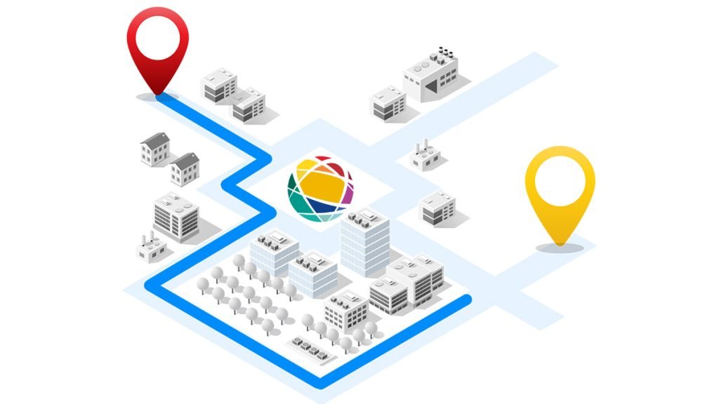
Website Navigation is one of the first things visitors notice. It guides people to pages, products and contact details. If menus feel confusing, users often leave quickly. However, when navigation feels simple, people stay longer and explore more.
Good navigation also supports SEO. Search engines use internal links and site structure to understand content. Therefore, a clear menu can help important pages rank better. It also improves trust, which can increase enquiries and lead generation.
Strong menus are not only about looks. They are a core part of smart web design and user experience.
Keep Main Menu Options Simple
Too many choices slow people down. Instead, aim for a short list of clear menu items. In most cases, five to seven top-level links work well.
Use labels people understand straight away. For example, “Services”, “About”, “Pricing”, “Blog” and “Contact” are stronger than vague words like “Solutions” or “Explore”. As a result, users know where to click without thinking.
Short labels also look cleaner on mobile screens. Since many visitors browse on phones, this matters more than ever.
Use Logical Website Navigation Structure

Arrange pages in a way that feels natural. Start with broad categories, then place detailed pages beneath them. For example:
- Services
- Web Design
- SEO
- Lead Generation
This hierarchy helps users move deeper into the site with ease. Likewise, it helps search engines crawl content more efficiently.
If your business offers several services, group related pages together. That makes your website design cleaner and easier to scale later.
Make Mobile Navigation Easy to Use
Mobile traffic now dominates many industries. Therefore, menus must work perfectly on smaller screens.
Use a clean hamburger menu if needed, but keep it simple. Ensure buttons are large enough to tap. Also, leave enough space between links to prevent mistakes.
Test menu speed on real devices. Slow slide-out menus can frustrate users. Fast interactions improve engagement and reduce bounce rates.
You can test mobile usability with Google PageSpeed Insights.
Add Clear Calls to Action in Website Navigation
Your menu should guide visitors towards action. Therefore, include a clear call to action such as “Get Quote”, “Book Call” or “Contact Us”.
This works especially well for service businesses that rely on lead generation. While users browse, the next step remains visible.
You can style this menu item as a button to draw attention. However, keep the design consistent with the rest of the site.
Use Sticky Headers Carefully
A sticky header stays visible while users scroll. This can improve engagement because navigation remains available at all times.
For example, someone reading a blog post can move to your services page without scrolling back to the top. As a result, page journeys become smoother.
Still, avoid oversized sticky headers. Large bars take too much screen space, especially on mobile. Keep them slim and tidy.
Improve Website Navigation with Search and Filters
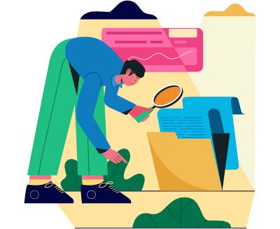
Larger websites often need more than menus alone. Internal search bars and page filters help users find content faster.
An online shop may need filters for size, colour or price. A blog may need category search. Therefore, think about what your visitors need most.
Better discovery tools can increase time on site, product views and conversions. They also support stronger SEO through improved engagement signals.
Use Breadcrumbs for Deeper Pages
Breadcrumbs show users where they are within your site structure. For example:
Home > Services > SEO
This small feature improves orientation. It also gives users a fast route back to broader pages.
In addition, breadcrumbs can appear in search results. That may improve click-through rates and help search engines understand page relationships.
Reduce Friction with Consistent Navigation Design
Keep menus in the same place across the whole website. If navigation moves between pages, visitors may feel lost.
Likewise, use the same colours, fonts and hover styles throughout. Consistency builds confidence and makes your brand feel professional.
This is where quality web design makes a major difference. Good design removes friction before it becomes a problem.
Use Analytics to Improve Website Navigation
Do not guess what works. Instead, review real user data.
Use Google Analytics to track behaviour flows, exits and top landing pages. Then review where visitors drop off.
You can also use Hotjar for heatmaps and session recordings. These tools often reveal menu issues quickly.
For example, users may ignore an important service link because the label is unclear. Once changed, clicks may rise.
Common Navigation Mistakes to Avoid
- Too many top-level menu links
- Confusing labels
- Hidden contact details
- Menus that fail on mobile
- Slow animations
- No clear call to action
- Broken internal links
- Different menu layouts on key pages
Even small issues can reduce trust. Therefore, regular checks are worthwhile.
How Website Navigation Supports SEO and Conversions

Great Website Navigation helps people and search engines at the same time. Users find what they need faster. Search engines crawl pages more efficiently. Important pages gain stronger internal link signals.
As a result, your site can earn better rankings, longer sessions and more enquiries. That means stronger SEO performance and better lead generation.
Navigation is not just a menu. It is a growth tool.
Key Takeaways
- Keep menus short, clear and easy to scan
- Use logical page hierarchy and internal linking
- Prioritise mobile usability and speed
- Add visible calls to action
- Use analytics tools to improve menu performance
- Support users and search engines with clear structure
Conclusion
Strong navigation makes websites easier to use, easier to trust and easier to convert from. When visitors can move around without friction, they stay longer and take action more often. Therefore, improving navigation can deliver quick wins for engagement and long-term gains for growth.
If your current site feels cluttered or underperforms, reviewing the menu structure is a smart place to start.
At New World Digital, we build high-performing website design solutions that turn clicks into customers. We also provide results-focused SEO strategies and conversion-driven lead generation campaigns.
If you want a website that is easier to navigate and built to grow your business, get in touch with our team today.